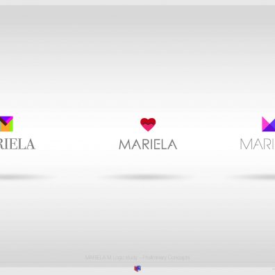
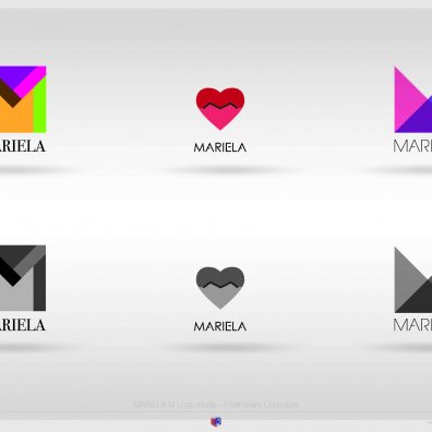
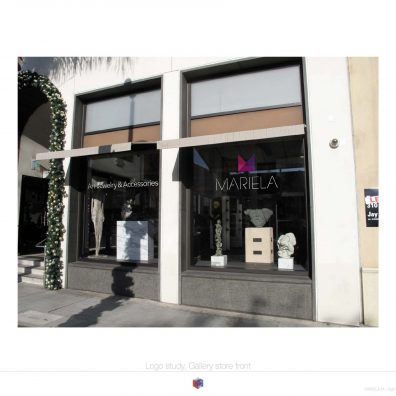
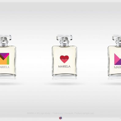
In this study I wanted to capture the personality and style of both Mariela Moodie the artist as well as the persona.
All marks are minimalist in their design yet this is achieved without sacrificing originality and style. Each one tells a slightly different story, highlighting different elements of Mariela’s style and personality. Color palettes are indicative and can be refined further, however I am satisfied with the results as presented.
The first concept is influenced by the Caribbean colors and art dear to Mariela, using bold colors and shapes to create a monogram which is playful and bold. The second concept is provocative, with the pursed lips as a red hearth with the M as a central element of the design. The third is the most ethereal and abstract, using three triangles and a n absent fourth one to create a wonderful tension as the M is not immediately discovered by the viewer.
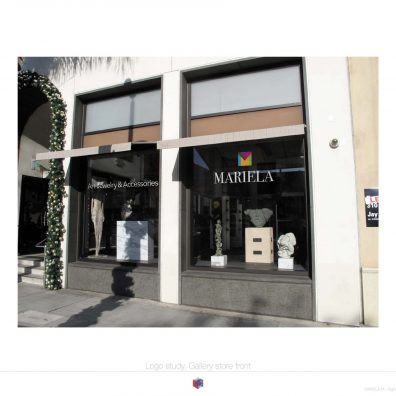
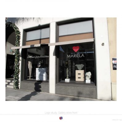
To me each mark has its distinct character, offering enormous creative potential for use in both brand communications as well as in merchandising applications.
Their versatility can be easily understood just by imagining a wide variety of applications. I sincerely hope that you will find them interesting, personally I enjoyed working on this project and I am happy with the results.
Functions:
Creative Direction, Art Direction, Print Production
Materials Produced:
Brand Identity: Logo study.
